

Mobile Rummy Interface Accessibility for Seniors: A Guide to Clear Cards and Confident Clicks
Let’s be honest. The tiny text, the confusing menus, the frantic tapping—modern mobile apps aren’t always designed with our parents or grandparents in mind. And that’s a real shame, especially for a game of skill and strategy like rummy.
But here’s the deal: it doesn’t have to be that way. With a little know-how, the digital rummy table can become as welcoming as the one in your sunroom. This guide is all about making mobile rummy interfaces accessible, comfortable, and genuinely enjoyable for senior players. Let’s dive in.
Why Interface Design Isn’t Just a “Young Person’s Problem”
Think of a great interface like a well-lit, well-organized kitchen. You know where everything is. The labels are clear. You don’t have to squint to read the recipe. For seniors, a mobile rummy app needs to offer that same sense of ease and control.
Common challenges? They’re more than just “bigger text.” We’re talking about:
- Declining eyesight: Struggling to distinguish between a Jack of Hearts and a Jack of Diamonds on a small, bright screen.
- Reduced dexterity: Accidentally discarding the wrong card because the touch targets are too small or too close together.
- Cognitive load: Getting overwhelmed by flashy animations, too many buttons, or complicated menu paths just to start a simple game.
These aren’t minor inconveniences. They’re barriers that can turn a fun mental exercise into a source of frustration.
Key Features of a Truly Senior-Friendly Rummy App
So, what should you—or the senior in your life—look for? A truly accessible mobile rummy game goes beyond a single setting. It’s a holistic approach to design.
Visual Clarity is King (and Queen, and Jack)
The visual design is the first, and most important, hurdle. It has to be crystal clear.
- Adjustable Text Size: This is non-negotiable. Look for apps that let you make all text—from menu options to chat messages—larger.
- High-Contrast Color Schemes: Dark mode isn’t just a trend; it’s a accessibility feature. A dark background with bright, clear card faces reduces eye strain significantly.
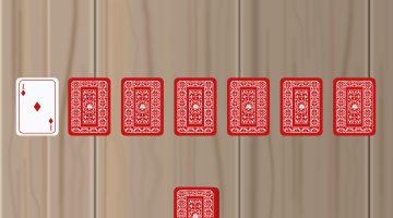
- Simplified, Classic Card Designs: Some apps get fancy with artistic card decks. For seniors, a standard, familiar card face is almost always easier to read. The goal is instant recognition, not artistic appreciation.
Touch and Interaction: Making Every Tap Count
Fingers that have dealt thousands of real cards might not have the pinpoint accuracy for tiny digital buttons.
A great app will have large, well-spaced touch targets. Dragging a card to discard or meld should feel smooth, not finicky. And honestly, a “tap to select/discard” option can be a game-changer for those who find dragging difficult. Look for an interface that isn’t crammed. It should feel roomy, giving every action its own space.
Navigation and Sound: Less Noise, More Clarity
Menus should be simple and logical. If it takes more than three taps to find the “Play Now” button, it’s probably not the right app.
Sound is another big one. Customizable sound settings are crucial. The ability to turn off distracting background music while keeping essential sound cues—like a “Your Turn” chime or the satisfying snap of a card being discarded—adds a layer of feedback that’s incredibly helpful.
A Quick Checklist for Evaluating an App’s Accessibility
| Feature to Check | What to Look For |
| Text Size | Can you increase the font size in the settings menu? |
| Card Clarity | Are the card suits and values instantly recognizable? |
| Button Size | Are the “Draw,” “Discard,” and “Sort” buttons large and easy to tap? |
| Menu Simplicity | Is it easy to start a new game or exit to the lobby? |
| Sound Control | Can you toggle music and sound effects independently? |
| Animation | Are animations subtle, or do they cause distraction? |
Beyond the App: Tips for a Smoother Gameplay Experience
Sometimes, the best solutions are outside the app itself. Here are a few practical tips:
- Use a Tablet: If possible, play on a tablet. The larger screen makes a world of difference for visibility and touch accuracy. It’s the difference between reading a paperback and a newspaper.
- Optimize Device Settings: Don’t forget the phone or tablet’s own accessibility features. Increase the system-wide text size, enable “Tap to Click” if dragging is hard, or reduce the screen timeout so the game doesn’t go to sleep mid-meld.
- Stable Internet Connection: This one is crucial. A spotty connection can lead to frustrating disconnections and timed-out turns. A stable Wi-Fi connection is your best bet for a seamless, enjoyable rummy session.
The Final Card on the Table
Accessibility in mobile rummy isn’t about dumbing down the game. It’s about clearing away the digital clutter to reveal the brilliant game of skill underneath. It’s about ensuring that a lifetime of experience with cards can translate effortlessly to a new platform.
The right interface doesn’t just make the game playable; it makes it a joy. It gives seniors back their confidence at the table—a digital one, sure, but a table where they can still outsmart their opponents and feel the thrill of a perfect sequence. And that’s a win for everyone.